App / UX/UI Designer / 2026

Case Study

SwiftSave

A banking app case study focused on clearer account visibility, simpler payments, and a more trustworthy financial experience.

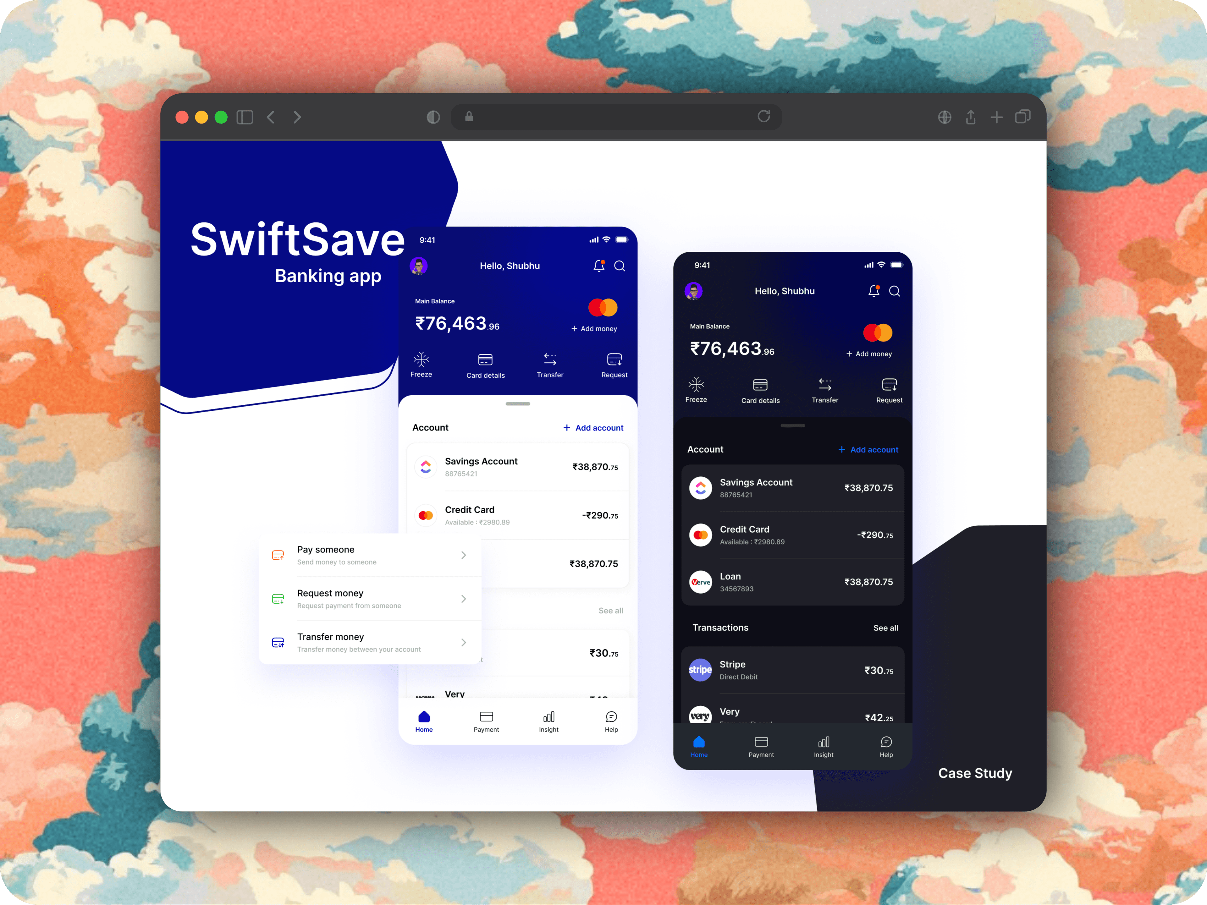
SwiftSave preview

Overview

SwiftSave is an online banking app concept designed to make financial management feel seamless, secure, and easier to understand.I worked on it as a UX/UI Designer, leading user research, UX/UI design, wireframes, user flows, the design system, and the interactive prototype.The goal was not just to refresh the UI, but to improve navigation, support multiple accounts more clearly, strengthen trust around security, and make core payment actions feel easier across devices.Research included 35 selected participants, with 27 responses shaping the direction of the redesign.

Context

The research phase started with participant selection and a tailored set of open-ended questions built around SwiftSave's product goals.One recurring pain point was navigation. Users said transaction details were difficult to find, categories felt unclear, and locating a specific entry often meant too much scrolling.Another recurring issue was security perception. Even when people believed the app was safe, they still wanted clearer communication about protection measures and more control over security preferences.Those insights led to three major interface improvements. The home experience was redesigned to show all synced accounts more clearly instead of relying on a confusing swipe pattern.The savings account view was simplified with clearer balance labels and easier-to-read visual cues, making account information faster to scan.The payment flow was also reworked so users can always see which account money is being sent from, with stronger labelling and a clearer visual indicator at every step.From there I mapped the feature structure, sketched the core flows, and created wireframes for the home screen, transaction history, settings, and payment journey to make the overall experience feel more logical and trustworthy.

Usability Improvements

These updates focus on the three flows that created the most confusion in the original SwiftSave experience: account visibility, savings clarity, and payment confidence.
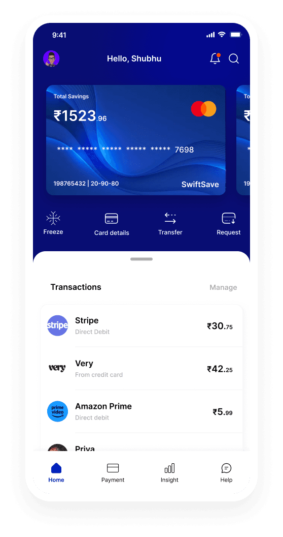
SwiftSave home screen before the account display redesign

Before Usability Study
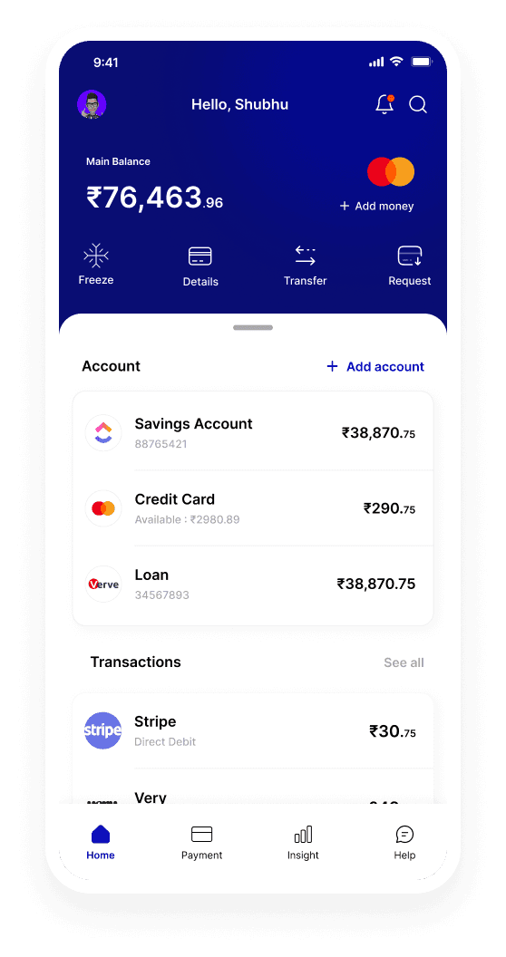
SwiftSave home screen after the account display redesign

After Usability Study

Different Account Display

Problem

Users frequently misunderstood the swipe-based pattern that revealed balances for different accounts, which made multi-account management feel unclear.

Solution

The home screen was redesigned to show linked accounts more explicitly, so users can understand what they have in SwiftSave and what has been synced in from elsewhere at a glance.

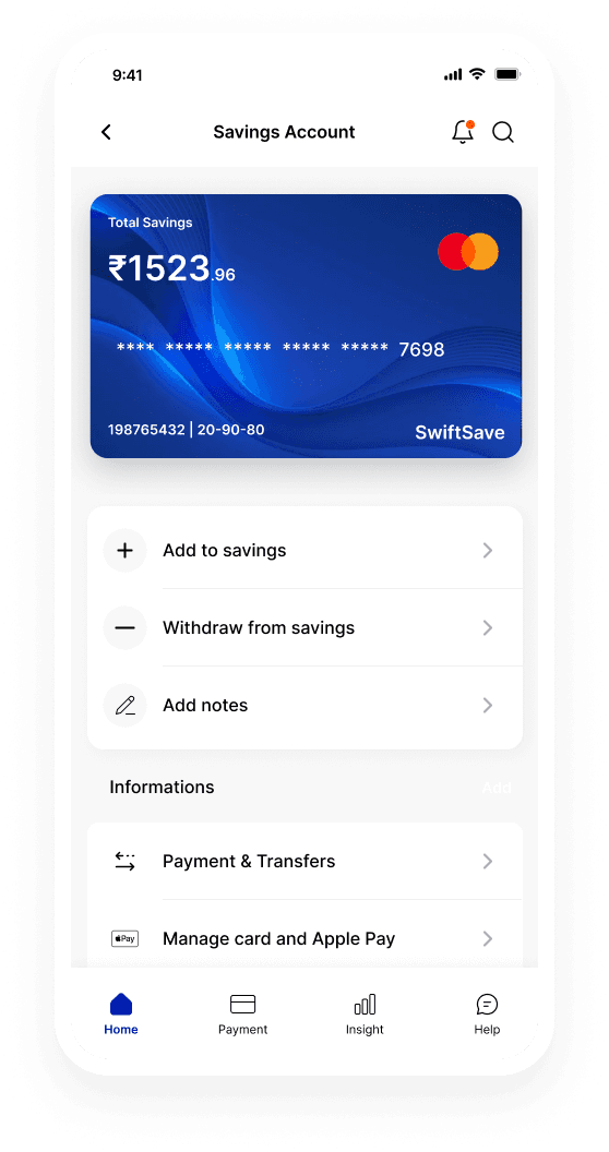
SwiftSave savings account screen before the redesign

Before Usability Study

SwiftSave savings account screen after the redesign

After Usability Study

Savings Account Display

Problem

Testing showed that savings account information was hard to scan quickly, and users struggled to understand the way balances and actions were presented.

Solution

The savings view was simplified with clearer hierarchy, more obvious labels, and easier-to-understand account actions so the most important information is immediately readable.

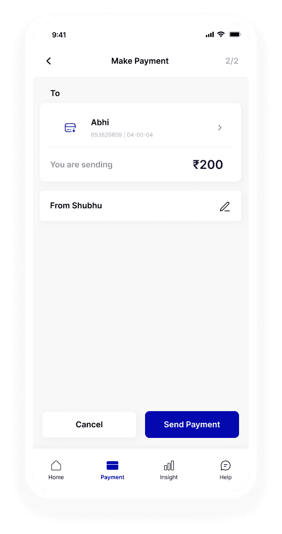
SwiftSave payment screen before the redesign

Before Usability Study

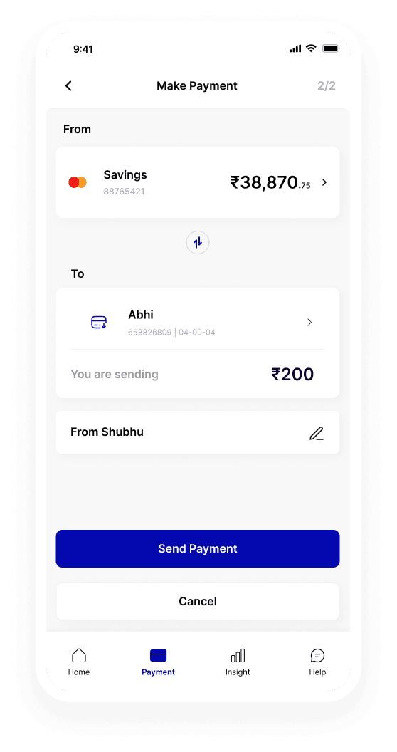
SwiftSave payment screen after the redesign

After Usability Study

Simplifying the Payment Page

Problem

During usability testing, users found it difficult to tell which account money would be sent from on the final payment step.

Solution

The payment flow now keeps the selected source account visible throughout the journey, with stronger labelling and a clearer visual cue around the chosen account.

Tools & Tech

Figma

Prototype

SwiftSave Figma prototype

The interactive prototype is deferred until requested so the case study page stays lighter on first load.